When designing a web site one of the first things to consider is the colors needed for the web site. If you know a little about color theory you already know that colors need to work in harmony with each-other, which in short means that they need to be balanced and look good together. To ensure that the colors work together most professional designers are very careful to select colors that are complimentary or analogous.
Complimentary colors are located opposite of each other on the color wheel. These are colors like blue and orange, purple and yellow, and red and green. When color compliments are used there is strong feeling of visual balance and stability.
Analogous colors are those located right next to each other on the color wheel, and while analogous colors provide little contrast when used together they match well and evoke a sense of blending and consequent harmony.
When using color compliments many designers will utilize what is known as a “Triadic Color Scheme”. Another popular option is the “Compound Color Scheme” or split complimentary. In this case two colors are chosen from opposite ends of the color spectrum as illustrated following.
- Warm colors evoke a sense of warmth and well-being like mid-tone red, yellow and orange.
- Cool colors make people think of cool and winter, colors like blue, green and purple.
- Neutral colors, as the term suggests, don’t create much of an emotion. Colors like grey and brown are neutral colors.
What I’ve noted above is the early part of color theory that most should be aware of. There are many tools that can be utilized such as Kuler by Adobe that will help you define colors that will work in harmony. https://kuler.adobe.com/
As I’ve touched upon in color values, it is also important to define how the colors chosen will affect one’s reaction to a page. In many cases colors are defined by the seasons as you will see in fashion, cosmetics, and house painting. In this case the winter colors are compliments of the darker saturated tones (ex. forest green, dark blue, burgundy, dark grey, etc), spring colors are light and cheerful (pink, light yellow, light blue, light green, etc), summer colors are bright and warm (mid-tone reds, orange, yellow, green, etc), and fall colors are warm yet more earthen in tonal value (browns, ruddy orange and yellow, brick red, etc).
If you’re a new designer you may be asking which color compliments, or seasons color is best for a specific design? In this case I always ask, what is the target audience? If it is young children or about fresh beginnings I will go with a spring color scheme. If the site is for a professional institution or business I will typically go with a winter or fall color schemes since they represent stability and maturity. If the web site is for young adults or for entertainment I will go with a summer color scheme in most cases.
The next consideration when choosing colors is the type of images employed. If there is existing branding that will continue to be used this needs to be integrated into the design layout. In this case I will sample the color values of the logo first before deciding on the color scheme. For example a logo might utilize orange, blue, black, grey, and white. In this case I will likely use white for the background area of the text copy, grey and black as accents, blue as an accent and/or wallpaper, and orange as accents and heading text and/or navigational elements. By introducing each of these colors in an effective way the page will seemlessly integrate and be in harmony with the existent branding.
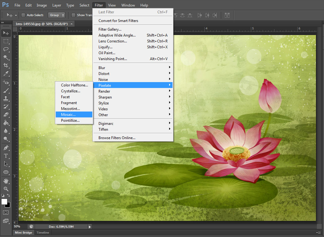
If there isn’t a logo, yet there is a feature image, or images, the next option is to sample the primary image for its color values.
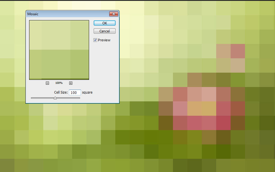
The image above has a nice spring colors and instead of guessing on which colors to choose I simply use the filter option of pixelate/mosaic and I can find the proper values as compliments.
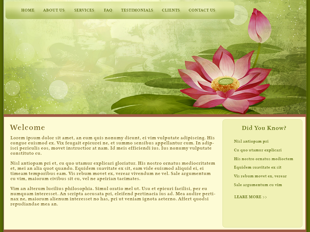
At this point I simply sample a variety of the colors and then choose where I want the colors to be applied. The following image represents a quick mock-up using the image and the colors I sampled. All colors used here were chosen from the mosaic. In addition I’ve added some drop-shadow to the sides of the layout and on the navigation text, as well as a bit of outer glow. And I used a subtle gradient for the nav bar to create a gentle rounded feel.

Upon final assessment the header is a bit large vertically, but since I don’t want to crop into the flowers I could utilize the space at left by adding a tag-line slogan, or a welcome statement. The important thing to remember is that each part needs to work in harmony with the other, so in addition to color harmonies you need to ensure that the text color and sizing provides effective contrast for maximum readability, that the colors chosen are balanced, and that the visual space is effectively utilized to convey your business message. By employing the dark pink as a horizontal dividing line below the image and at the footer I create a delineation of space while accenting the page with additional warmth. The dark green background helps to draw one’s eye to the lighter color values in the content area. This design would be effective for a business such as aromatherapy, massage, Eastern philosophy, and Naturopaths.


