Google Plus has been around for a while now, and while it is still in its infancy, I believe that it will become the de facto standard of social sharing in time. If my interest was only sharing content to friends and family I would wait on Google Plus since no one really needs to invest more time learning another social platform; for a business that needs to stay competitive, well, I think that this platform, being “Google”, does require our attention. In my upcoming September newsletter I reference some of the reasons why utilizing Google Plus is important, and if you do a bit of searching you’ll find much discourse about the pros and cons (mostly pros) of using this platform. That being said, I wanted this post to focus on “how” to use Google Plus effectively.
Firstly, to create a Google Plus account go to: https://www.google.com/+/business/
When you first create a Google Plus account you will have created a personal profile page. This page can be viewed and edited at any time by clicking the View your profile link at the top right of your browser window.
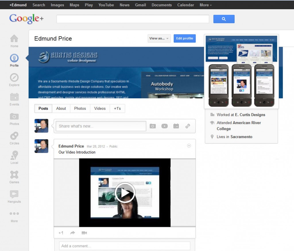
Upon doing this you will be at the “profile” page which is laid out in a similar fashion to the Facebook “Wall”. The primary navigation options are on the left column with posting and content sharing options in the content area of the pages.
Ok, so looking at the left-column navigation:
HOME
This section works similar to the news feed section of Facebook (what you see when you click the Facebook Logo). Here there is a “share what’s new…” box at the top with the options of share a photo, video, event, or link, and the tab options of “all”, “friends”, family”, and “more” (the “more” category has a arrow with drop-down section which will provide the listing of your “circle” types (more on this later), which for me this is “acquaintances”, “following”, “clients”, and “colleagues”. The last two categories were added by me in the “circle” section. The most engaging part of this sharing section is the ability to “Share What’s New…” to a specific circle group; this is really quite powerful from a targeted marketing perspective.
Below the posting box is the news feed which contains popular Google Plus posts (“what’s hot on Google Plus) and posts from your circle contacts. At the right column of the “Home” page is an “invite friends” section, followed by “Trending on Google Plus”, “You might Like”, and “Events”. And in ther far right column is “Start a Google Hangout” which is the video conferencing connect option of Google.
PROFILE
This section will have your profile name at the top followed by a header image. There is the option of “View as…” which allows you to view it as public, or you can enter a name of a contact and see how they would view the page. Next to this is the blue “Edit profile” button (more on this later).
As for the header image, when you mouse-over it you will see the options of “change cover photo” and “drag to reposition”. You will likely want to change this photo so select this option and you will the choices of “gallery”, “upload”, “your photos”, “cover photos”. Ok, so the gallery will allow you to select a Google image for use (similar to if you have Google as your browser home page), and the upload option will allow you to upload your own image (placed in your photo gallery scrapbook). In case you are wondering how this image compares to the Facebook cover image …. from a screenshot I found the dimensions to be 890x180px, and while the Facebook Cover is 851x315px (which is not as wide) Google Plus expands the image some which reduces the actual image size (this pixelates text a bit so be careful here). The image can be repositioned, yet it does not allow you to reposition at the left column only vertically (so be sure to crop to the left edge). For the sake of illustration I added my Facebook cover image and found that it only showed 812px of its actual width of 851px yet it expands the image to 890px (which is not ideal).
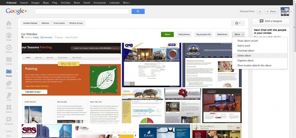
* Note that all of the cover images you create are added to the “cover photos” section so you can select them easily later. If you want to remove your cover photo versions (I had several test versions) go to the “photos” icon on the left side, select “albums”, and then select the “scrapbook photos”. From the tabs at top select “organize album” and then click upon the images you want to delete (cntrl-click to select multiples at once) and you will see a red border around them. Select the “delete” button at top.
Below the header image is the tab options of “posts”, “about”, “photos”, “videos”, and “+1’s”. As you can imagine, whatever you’ve added in these categories are shown here, with the +1’s being those posts/pages you’ve recommend in your time on the Web.
At the right column of the profile page we have your over sized profile photo (yes, again expanded in size…really?); note that the image needs to be at least 250px in size for both width and height or it fails to upload. For best fit, be sure to size your image with the same height/width dimension and of course at least 250px width/height.
Finally, with every post there are the options to +1, share, and start a google hangout about it (small icons below the post). This is important from a social sharing perspective, so I would suggest getting in the habit of promotion your own posts and images with this section.
EXPLORE
This is similar to a more interactive version of what Twitter offers. Again we are provided the “trending” news feed selections. This is a good place to waste time, yet otherwise ignore.
EVENTS
This section allows you to create an event and then share it. This is in essence an event calendar wherein you add a cover image, and event title, event date, location, details, and an invitation section by names, circles, or email addresses.
PHOTOS
When you mouse over this icon on the left-sidebar you have “instant uploads” and “albums”. If you click the icon you will arrive on the “instant upload” page, with tabs at the top of “instant upload”, “albums”, “from posts, “photos of you”. The instant upload section is geared toward integration with mobile so they provide an app download here, and the ability to upload photos from your phone. The images you upload are stored online (picassa), The “albums” will have your different album folders. At the top are the options of “upload new photos”, “sharing settings”, and the “gear” (settings icon) which is similar to the settings section of GMail (or the admin section of Facebook).

I have found that once an image has been added it is not always so easy to remove it. If you encounter this problem then just set the viewing option as “only you” instead of public.
CIRCLES
This section is nicely done. In short you will see all of the people in your circles with large “circle” icons at the bottom. Here you simply drag/drop a circle contact into the circle category that they belong to. And much like Facebook, you will see options to add people to your circle you might now, which of course is being populated from your GMail contacts.
LOCAL
This is the “Google Places Local” which is the review site and business overview with map. My assumption is that you are familiar with this, yet if not, know that every business should be listed here. As for Google Plus, this section simply provides recommendations of places based uon your area, and you can learn about their new scoring system.
GAMES
For those who love to waste time there is a games section.
HANGOUTS
This is the new Google Video page which will allow you to create a video meeting for everyone, those in one of your circles, or by invitation. I don’t utilize this yet, but I definitely plan to.
MORE
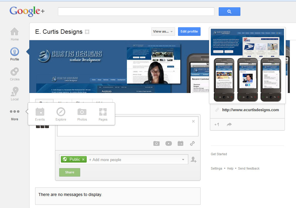
The last item here is the “more” icon. By default this only has “pages” contained within it, but what is nice about this is that it serves as a folder wherein you can drag/drop the other icons into it so as to remove them from view. Since I don’t visit events or explore, I just did a drag/drop into this folder and they were out of sight.
Google For Business – Pages
This of course brings me to “pages” which is what I would suggest for most businesses to use and have linked to, not the profile. Much like with Facebook, the “page” option is related, yet separate from the regular “profile” section.
In this “pages” section you have the option “Create new page” or if you already have a page created to “switch to this page”. Note that when you mouse over the icon for the page there are additional options of “settings” and “managers”. The settings area is similar to what the profile section option, here you can add a phone number, and define who can send you notifications, etc. Managers is what you would expect (the page administrator), who can make changes to the page.
As with the “profile” section there are the same navigation icons on the left, yet that being said, the content of home and profile areas are a bit different.
HOME
Here we have the “share what’s new…” box, with the tabs above of “all”, “following”, “customers”, and “more”. More consists of “VIPs” and “Team Members”, … added by name or email.
PROFILE
Upon mousing over profile you will see profile options for your user name, and for your page. Selecting the page option here we are back with a similar layout to the profile section with your page title at top-left, and a cover image photo. Since this section is independent of the profile section you will need to upload images again (you can’t use the existing profile images).
Once you have added content to the provided areas go to the “about” tab (under your business name and the image applied), and select the “link website” button. Here you will be provided a link to add to your website/blog pages as shown following:
<a href=”https://plus.google.com/102410372834698912542” rel=”publisher”>Find us on Google+</a>


