When it comes to great web pages, the ones that really catch our eye are those that have good photos. Whether a photo is “good” or not may seem obvious, yet I can tell you from experience that few people really spend much time in consideration of the images added; they simply use what’s easily available. Considering how important your website is, and the impact that images will have on the viewer’s perception of your pages and business, I believe that everyone who has a web site needs to understand the elements which makes a photo effective.
You may be asking, well, what makes you an expert on what is effective? First I should note that my father is a professional photographer, a photographic judge of umpteen years, and winner of numerous photographic awards both local and international; over the last 40 plus years I have seen thousands of his award winning images, and had the privilege of learning from him first hand on what makes a photo great. Moreover, I have taken and edited photos most of my life, have had classes in art theory and art history, as well training in photographic editing, color theory and layout design for the web.
If you would like to view my father’s images some of his are online at: https://www.willispricephotography.com/
Okay, so I spend a lot of my time advising clients on which images are best for use on their web site; yet if you are the “hands-on” type and what to know how to take your own photos and select your own images then this blog post is intended for you. My hope is that the following information and illustrations will help you better define the qualities that make up a great photo, and aid you in selecting the best ones for your pages.
The Basics – The best images will grab you upon first glance. The image needs to be compositionally strong, utilize contrasts in lighting, use color effectively, and where applicable employ gestures and props to add dimension to your message. These each work together to tell the story of the photo.
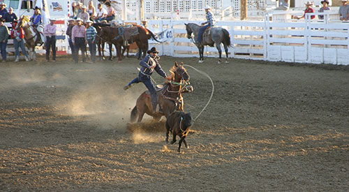
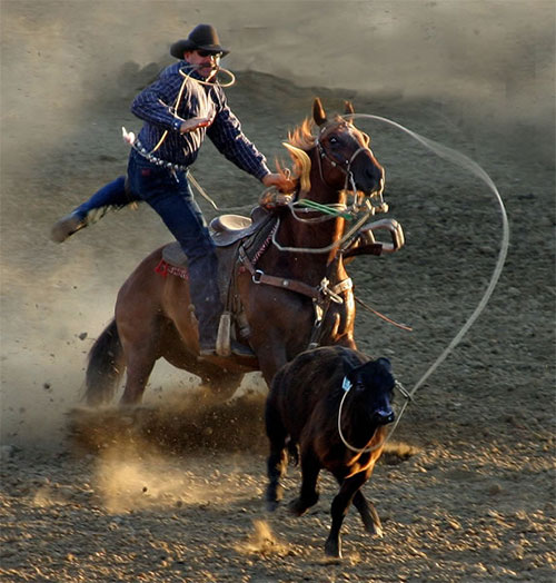
As you can see from the before and after versions, the first image was effective in part since it showed a compositionally strong subject with gestures (the expressions provided by both the the rodeo participant and horse, and those watching). The problem is that for web use it is unlikely that the image could be added large enough to do justice to all of the scene elements. The focal point is the rider, horse, calf and related scene elements; in this regard I improved the impact of this image by cropping it to just these elements, adding dust behind the rider to remove the fence since this would have detracted from the composition, and I enhanced the eyes of both the horse and calf by using the “dodge” tool in Photoshop. This with a bit of color/contrast enhancement dramatically improved the impact of this photo.
Every image needs structure and compositional order. Structure consists of the underlying colors, shapes and contrasts between light and dark. Once the image catches your attention it needs to have details to keep the eyes interested. For the above image the details are the slack and tightness of the rope, the puffs of dirt clouds, the lighting in the horses mane, and of course the eye gestures of the horse and calf.
The important thing with the composition is to ensure to exclude everything not directly contributing to the image. If you are taking photos for of your business then place objects in the scene which contribute to your message. A good photographer often uses “props” to contribute to the overall message. If you are a restaurant and you are showing baked bread you may want to place the bread on a clean wood cutting board with a sharp knife adjacent to it and the clean chrome oven in the background. If you are a landscaper you may want to show your latest project with a shovel and rake in the photo, with a tray of brightly colored flowers soon to be planted. Each of these additional elements will contribute to the message that you want to convey.
When taking the photo move the camera to fit your elements as you want them. If the end result isn’t ideal then the image should be cropped to achieve the desired result. Do your best to keep details out of the corners, and be sure that important elements aren’t cut by the frame edges.
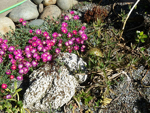
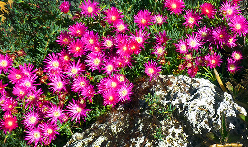
This above image shows a cactus garden that badly needs tending from my home. The before photo scene has decaying cactus, a hose, a dark corner in the upper-right, and a gravely area in the lower right.
The after photo simply cropped out the elements which didn’t work, the color was enhanced by “saturation”, and the “burn” tool was used darken the corners. The darkening helps to frame the image and draw the eye toward the center.
The next consideration is the use of color. There are a lot of resources about the use of color, in fact I have a web page dedicated to this. As a rule warm colors, red, orange and yellow, appear to move forward towards the viewer. Our eyes are attracted to them first. Cool colors, greens, blues and violets, recede away from the viewer. Where possible ensure that the colors in the photo are harmonious or complimentary; these will ensure visual balance. If your web page is dark then bright colored images will have a greater impact, one reason why photographer web sites are often black.
Lighting – lighting is the biggest contributor to colors, and to the impression given by shapes and lines. The important thing is to ensure that the key image elements are illuminated well. For this reason it is necessary to choose the right time to take the photo, which for outside photography is typically dawn and dusk. The reason for this is mid-day sun will cast strong shadows which decreases the images impact in most cases, makes it hard to differentiate details, and lessens the visibility and impact of colors.
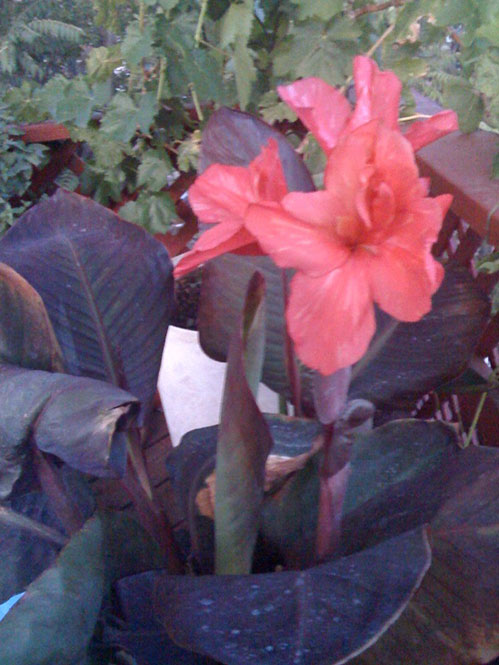
Here is a flower from our deck shown with poor lighting, and visually blurry. Below is tte same flower photographed at the proper time, yet otherwise not enhanced.
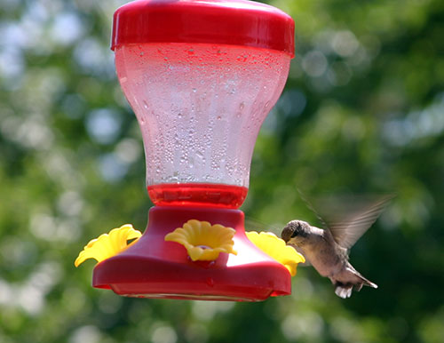
As you can see it very effective when background elements that might otherwise detract are blurred out. Of course we want the focal point to be as sharp as possible, but most camera’s have the option to blur out faraway elements so just select this option when taking a close-up photo.
This image of the hummingbird above works in that there is a balance of movement and stillness; the vibrant red is complimented by green (complimentary colors), and the lighting highlights the top of the bird’s head. By zooming in on the focal point of the action this picture is much more effective than the original.
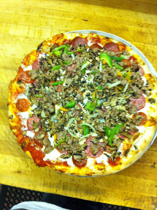
The Story – The best images have a story. Every image is saying something, if it entertains us, engages, affects us on an emotional level, then the story works. Even an inanimate object, such as a pizza has a story to tell. Below are two images of one of my client’s. The first one doesn’t engage, while the second does. What is the difference?
The first has a lighting over-exposure, is a bit blurry, is shot at an angle that doesn’t flatter, and utilizes no props. The pizza itself is off the plate a bit which distracts, and the bright yellow cutting board doesn’t provide enough lighting contrast with the yellow of the pizza crust. This second image has very warm tones, and effective props (dark wood cutting board and steel pizza tray with warm glow) and the background being dark effectively frames the focal point of the image and draws our eye to the pizza.
This second image’s story is … Gourmet pizza that is fresh out of the oven and delicious!
In summation, a good photo needs to be sharp, have good lighting, and needs elements that contribute to the image or are otherwise removed. The images on your website will affect how your visitors feel about your business so take care to choose only photos that engage and tell your story.
Need expert help, please feel free to contact us.
https://www.ecurtisdesigns.com
