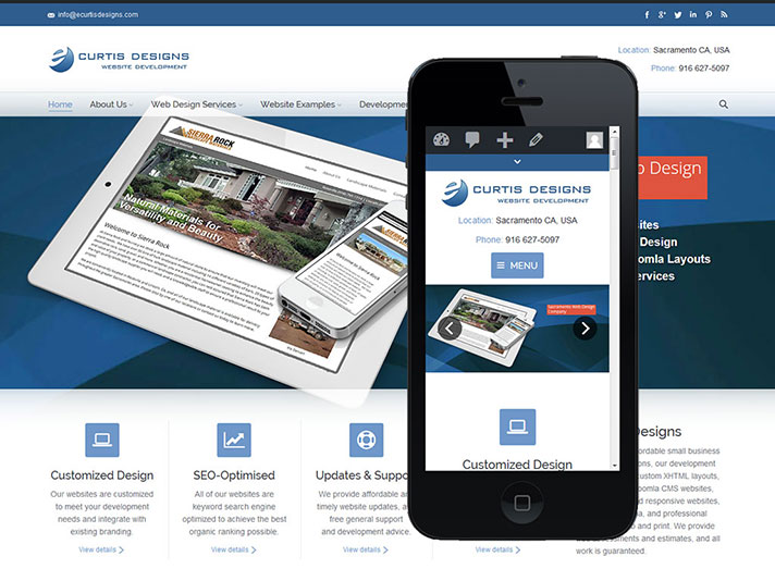
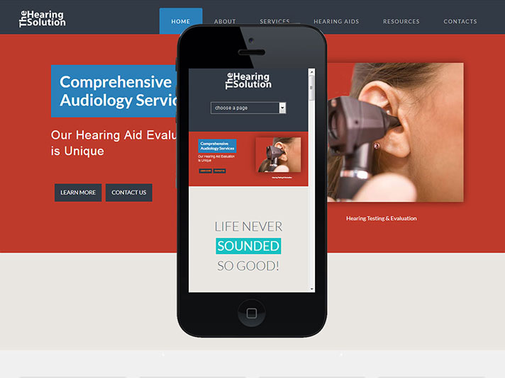
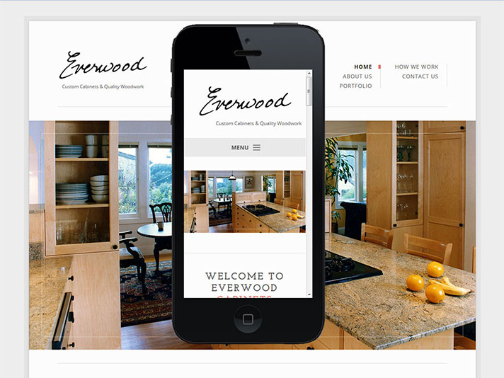
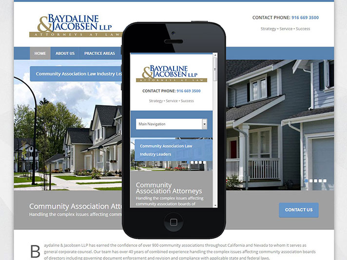
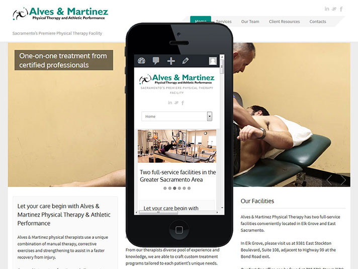
There has been a steady increase in mobile internet use. As for December 2024 Mobile accounted for 63.06%, Desktop at 35.08%, and Tablets at 1.86% of market share worldwide. This data is important since it underscores the importance that the websites we design must look great on both desktop and mobile devices if we are to meet the needs of the typical business website visitor.
I know that some of you have questions on responsive and mobile-only designs, so this page was created to help explain things some, and to provide some visual samples of what a responsive layout will look like.
Mobile Websites
The first mobile websites were created around 2010 in response to growing number of people viewing websites with mobile phones. Many businesses quickly recognized that most desktop display websites were difficult to navigate (the constant need to zoom in and zoom out was irksome), there were page loading concerns since mobile networks weren’t especially fast at rendering pages, and some of the scripting used and features found in websites designed for full-sized monitors didn’t display well, if at all, for mobile. The solution at that time was to create an additional “mobile-only” website, simplified so it would load fast, and then redirect the user to the mobile-only version by targeting the device type.
If you’ve used your phone to view websites for a while you have likely seen the mobile redirect wherein the URL is changed to a mobile “m.” sub-directory. Here are a few of our mobile-only websites we designed around 2010. Each site was developed with the JQuery mobile UI, and was created to look similar to the main website.


