If you’re using Google+ you will have noted that the cover image has changed in size. The maximum size your image can be is 2120(w) X 1192(h) pixels, though some people suggest using the minimum size, which is half of this full-size dimension, to ensure that the cover image loads quickly. The minimum size is 1060(w) X 590(h) pixels.
For the sake of testing, I tried both sizes. The end result was that the minimum size was visually blurry since the Google plus page image is “responsive” (resizes based upon viewer resolution) and I use a high monitor resolution.
The question of which size is best is based upon who you think your viewing audience is? If you expect most of your visitors to be almost exclusively mobile (phones and tablets) then I agree that the minimum size for the image is best since the smaller image will be smaller in physical size so load faster. Yet if you want to ensure a good image clarity for all resolutions, then you definitely need to go full-size. As an FYI, my “suggested” monitor resolution is 2560×1440, and while this is s larger resolution than many will use (or have as suggested), larger resolutions are becoming increasing common, especially for those of us with monitors that exceed 24 inches.
Of course the size of the image in bytes is important, but with proper optimization one can still create a large image that will load quickly. Most photos once compressed and converted to a high quality JPG (with compression for web output), will be reduced in size considerably from the original. My cover image was created at full-size, has a higher resolution than the web-standard (96dpi instead of 72dpi), and was saved as “high” resolution output … yet it only had a file size of 684kb.
Okay, so I know some will argue that the image size is TOO LARGE. I agree that this image size would have been considered very large in the past – at that time the typical web pages image would have been optimized to load fast on dial-up, and a size of under 100kb for most page images was necessary. Of course we have stepped beyond the web infancy … most people use fast broadband connections, and the typical web site of today will far exceed this image size since they will have multiple images and graphical accents on each page, a large header image or slideshow (usually at least 300kb), as well as css, jQuery, and other scripts that slow the load time; in consideration of all this just I think a single image at 600kb isn’t especially large. Personally, I would rather not sacrifice quality for a load speed benefit of a second or two.
Getting Started
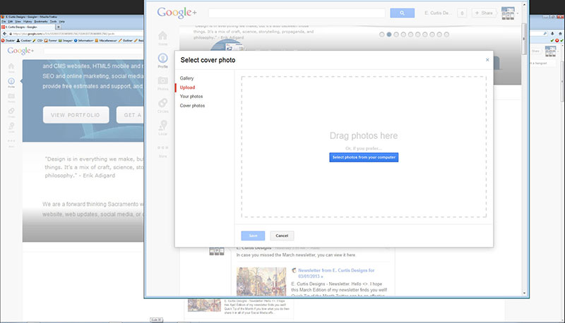
When creating your Google plus cover image all you need to do is create a blank canvas with the size you choose (maximum or minimum width/height dimensions, or something in between). Once you create your image just log-in to Google Plus you will see the “change cover” notice at the bottom of your current image. You select this and a new window opens with the option of “Select cover photo”. Here we have the options of “Gallery”, “Upload”, “Your photos”, and “Cover photos”.
If you have added images previously to your Google plus page/s, these will have been saved in one of the aforementioned categories. If you want to use an image you’ve previously added then you can navigate to where it is at and select it. For most people though they would need to select the “Upload” option wherein you can “Drag photos here” (photo actually) or you click the blue button which reads “Select photos from your computer”.
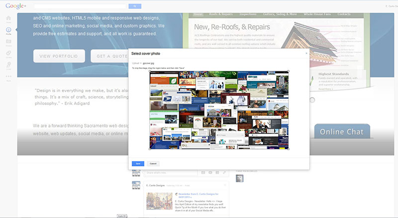
Next you simply navigate to the image where you have it saved. For most people it will be “my documents”, “my photos”, or “desktop”. Once you select it you will see a bounding box. Here you grab the white squares at the corners and expand the image to the four sides; this will ensure that your full image is included. Note that if you had uploaded an image that had a wider width and/or height dimension than the maximum allowed then you would have to crop your image to meet the required dimensions. Likewise, if you image is smaller in height/width than the minimum you would need to move the bounding box to the borders of your image. Once you are done click “save”.
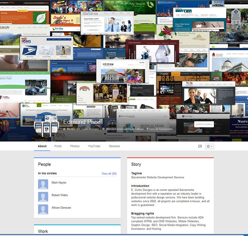
Now that we know the size requirement and how to add an image, the question is, what will look best for this image? The first thing of note is that the bottom portion of the image has a grey gradient applied automatically; on top of this is your name, a round image icon, and other text Google added (where you worked, college attended, city lived in). Upon a quick estimate, approx. 20% of the entire image is affected by the gradient. For the sake of readability one might want to just create a solid color on the bottom of the image to differentiate this portion from the rest. or darken the opacity a bit more. For my image I simply placed my project photos without considering the gradient (my next revision will likely take this into account though).
On a final note, one needs to decide how to best use this image? For myself, I wanted to show the depth of my work, so I included many of my websites in a collage format. In short, I am showing people that when one chooses me as their designer they are getting an experienced designer. For your business you might want to have product photos, a view of your building (inside and/or outside), or something with a marketing flare like a promotional Ad. This is the fun part of design, so let your mind go to that creative space and create something that will catch the eye. I have read that animated gif’s are possible on the banner, which would allow for incorporating a bit of movement … very effective when done correctly. Most importantly, use the cover image to “brand” yourself. What I mean by this is ensure that the image is visually similar to what you have on your website, your Facebook page, your Twitter image, your Blog, your print marketing, graphical ads, business cards, etc.
As always, if you need assistance with any of your Social Media efforts be sure to contact me.
https://www.ecurtisdesigns.com


