If you are a new web designer you may have been faced with the question of how to create attractive buttons for inclusion on web pages? Since most web designers are primarily coders, this can be a challenge, even for those who do have a bit of understanding on how to edit photos effectively. If you don’t have good graphic editing software or skills you can always purchase web buttons online. The problem with this option is that in many cases you will want something more custom, or sized differently from what is provided.
The first question is, what makes a button attractive? Clearly it needs to integrate well in the layout, yet beyond this consideration I find buttons that work will often be rounded just a bit on the edges, and employ a subtle gradient. Note where I wrote “subtle”, if the gradient is too defined then the text will either be difficult to read, or it will just look amateurish.
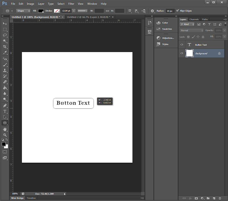
Assuming you have Photoshop, create a new canvas size of relatively large size. I typically will start with 500×500 px. On the canvas select the rounded edge tool and create a button of the length you need. This of course is important, so it is often best if you add your type first. The corner radius is 10 px by default, but you can adjust this if desired by adding a new value in this box (top of screen).
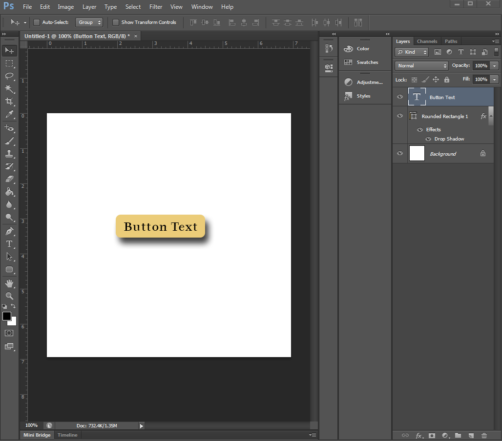
As you will see from the screenshot following, I initially have just two layers. The bottom layer is the (canvas), and a top layer where the text is added to the approximate center on top of the canvas layer. I select the background layer below my text (so I can still see my text) and then draw an approximate button size with consideration of the need of space between the text and the sides of the button. This doesn’t have to be perfect since we can always resize the text, position it, and apply kerning later as desired.
The foreground color (by default black) will now fill the button. Okay, so assuming you have a blue website background you might want a white button, or possibly orange as a color compliment. click on the button icon and the color picker will be shown. Here you simply select the color you want or enter the hexadecimal, RGB, etc value you want. After this you add some drop-shadow to the button and a simple button is created.
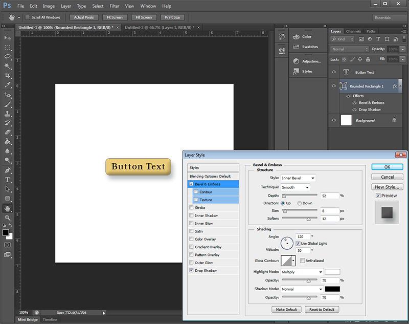
Assuming you do want to go with a single color value, then you can improve upon the look by adding a bit of bevel (bevel and emboss). As with drop-shadow you select the rounded rectangle layer and “add layer style” option (fx). By experimenting with the sliders for depth, size, and soften you can get that nice “pill button” bevel effect.
As you can see from my screenshot I selected a small depth and size, and a large amount of soften. I positioned my text up slightly higher on the button, and reduced the intensity of the drop-shadow. Of course if my button was darker I would have used a light colored text (typically white for optimal contrast), and I would have adjusted my bevel levels differently since the shadow effect would render differently on a dark button. For dark buttons I some times use a bit of inner glow as well.
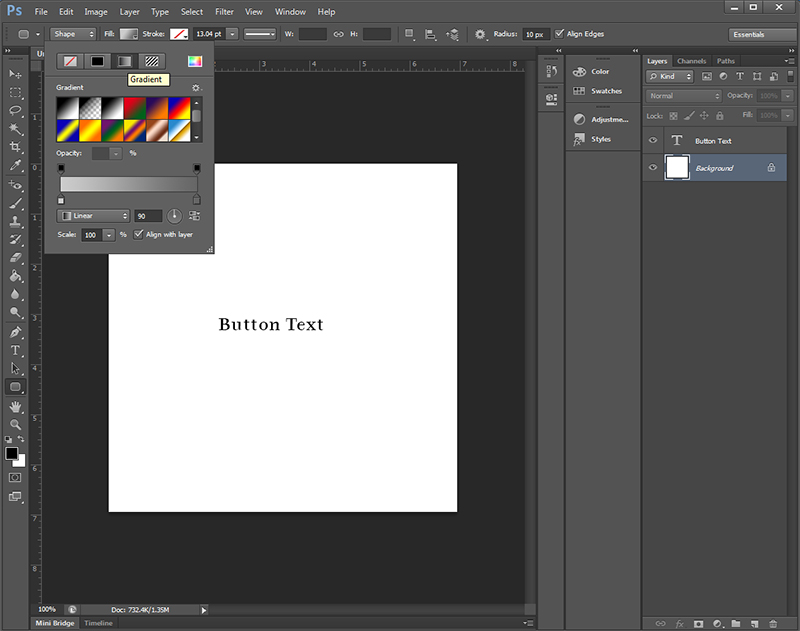
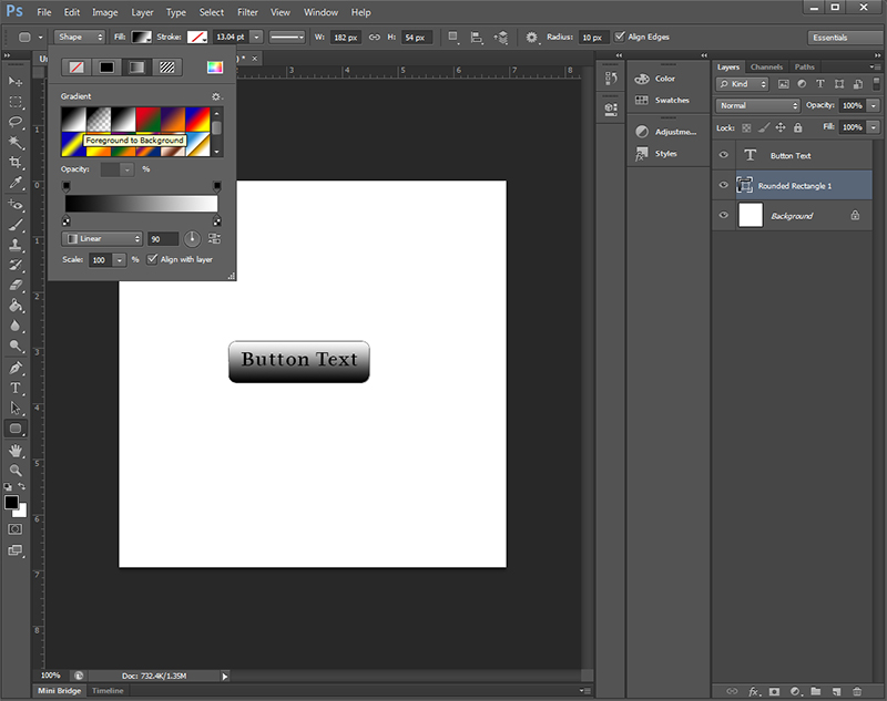
Okay, so while the above method is quick and works well for some uses, for really great buttons you need to apply a gradient. Since I like clean, contemporary layouts I will often create silver buttons. To do this you would delete the layer with the drop-shadow, bevel, and round rectangle. You select the round rectangle tool again, and got to the top and select the option of “fill”. Click on the icon and you will select the gradient box. The first three are based upon the color selector (foreground/background colors), which again by default is black/white.
You again draw your button dimensions to fit your text, yet I typically add a bit more height to my button since this helps avoid the cramped feel that often occurs with smaller buttons. You select the gradient by clicking on “fill”. select linear, without a stroke.
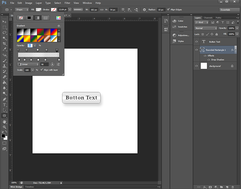
Next you will want to edit the gradient. I like the basic look but the black is too dark, so I am going to change this to a bit more silver. You will see the black square at left, click on this and then change the color value to what you prefer. For me, I went with black, white, and a light grey (#cccccc).
The goal is to position the highlight into the center strip (or slightly above the middle) with a subtle darkening to the edges. By moving the color sliders, adjusting opacity, and adding/removing the color squares as needed you can create all of those amazing gradient effects often found in premium styles. There are too many options for me to cover this well, so my advice here is to experiment. If something works then make a note of it, and save the authoring file for later reference.
And be sure to save your final button as a PNG unless you are certain of the background color it will be used upon. Note that no beveling was used in this final button, and I have again reduced the drop-shadow both by apply a lighter color value and reducing of its opacity.
