If you’ve read my previous post “WordPress – Step Three” then you know how to create pages and posts, work with links and widgets, create categories and edit comments, and upload images to the media library. In a nutshell “steps one through three” were the fundamentals on how to use WordPress, yet to really get the most out of it we now need to delve a little deeper so as to learn how to use it to its potential.
The WYSWYG Editor:
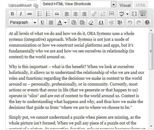
When working with pages and posts you likely noted that there was an HTML and Code editor (known respectively as “Visual” and “HTML”). The visual editor is where you’ll spend most of your time when creating new pages/posts. This editor has icons similar to what you would find in MS Word or Word Pad. From left to right we have: Bold, Italic, strike-through, unordered list, ordered list, quotes, left align, center align, right align, link, unlink, insert more tag (used when you want to have text only visible up to a point, and then they click “read more” for the rest to be shown on the page), spelling check, full-screen mode, and show/hide icons. When you select this last show/hide a second row of icons are visible which are: paragraph (includes heading tags), underline, text justify, text color, paste plain text, paste for word, remove formatting, insert custom character, indent/un-indent, back, forward, and help. At the very top‐left is the “upload/Insert” link which allows you to add an image to a post by either uploading from your local computer or selecting an image already uploaded to the media library.
I trust most of these icon features will be familiar to you so I am not going to explain these in detail for now. My suggestion with these, and all WP tools, is to just experiment some. Whenever I begin development using a new WP theme I always create a dummy page to try out the different shortcodes that are unique to this theme. In addition, most commercial themes will have column options (more on this follows), for now I just wanted to note that the column widths will “typically” be defined in pixels to fit in the layout at full-width; I note this since using a sidebar on a page will often cause the columns to wrap and in effect break the layout. Another eccentricity of WordPress is that some browser settings will disable the “paste” command by default. In this case just use “cntrl-V” which is a “paste” keyboard shortcut.
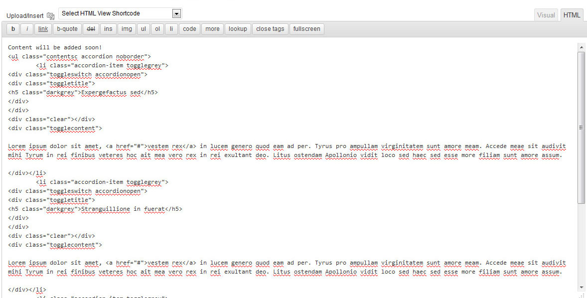
All in all I don’t expect anyone to have much difficulty using the editing environment. The part that baffles some are the theme shortcodes which as I touched upon us used to add columns, and other page elements such as theme specific typography, layout spacing, gallery images in lightbox, buttons, lightbox display of videos, teasers, theme styled lists, toggles and accordions, and other diverse options unique to your chosen theme. As I noted above, there is the “Visual” and “HTML” view of the page/post. While the visual editor will be used most often, the “HTML” is used when you need to add a shortcode that won’t work when added from the “visual” editor. Note that since WordPress hides most html tags you actually won’t see much difference between the two views, the exception being that if you added an image – in visual you would see the image, in HTML you would see the link to the image only.
Page Considerations:
At the right column you see the Publish area with the “Update” button in blue. Always publish/update a page to have it saved when you are done. WordPress also does auto‐saves which can be helpful if your computer crashes. The “Categories” section is where you assign a category to the post. I’ve touched upon categories before yet wanted to note that importance of keeping the category names short since in many cases you will want to link to these in a sidebar and/or footer widget and names look best when they don’t wrap to two lines, and you should also avoid special characters in category and widget names since they are typically not allowed.
You can assign a post to more than one category if you wish. You also have the option to “Add New Category” on the page (you will find that WordPress gives you several ways to do the same thing in most instances). The “Tags” section below the categories is used to show a relationships between posts – useful when you have hundreds of them.
The “Featured Image” that follows is for displaying an image when the post is brought in dynamically. In most themes the featured image is used for the portfolio area or sliders, but in some themes you will need to provide the image link (acquired from your Media library) in a custom input field near the bottom of the post for the gallery inclusion.
For the sake of illustration say you did want to add an image for a gallery, you would click “set featured image” and a box will open. Here you have the option of “from computer”, “from URL” or “Media Library”. I select “Media Library”. I have chosen to add “mynewimage.jpg” for the image so I click “Show”. A new window opens and I see the title (which I would change), alternate text area (which you should add something here for ADA), caption (I would leave blank), description (add something at your leisure), the link URL, the alignment (none is fine for this), size (I always select full‐size unless I plan to add it to a page though it can be edited once on the page), and then you choose “Use as featured image”, not “Insert into Post” (this simply adds an image inline with the text of the post/page). You will then see the image on the blog post above the text that reads “Removed featured image”. Now before you close the media library box scroll down to the bottom and click “Save all changes” and then go back to the top of the media library box and click the (X). Be sure to save the blog post page by scrolling to the top‐right column and selecting “Update” (blue button).
At this point it is a good idea to preview the page. You can do this by selecting “view post” in the yellow bar at top, but the better option is to select “view post” in the white grey button between “Edit” and “Get Shortlink”. This will open up a new window, whereas the previous will just load the page and you will need to remember to use your back browser button to go back to this page or you will have closed the window and need to login again to WordPress. Now when you view this page you will see the image at the very top of the post. Note that in some themes if you want the featured image to show you need to select “Image” under the “post type options”.
Page Types and Custom Sidebars:
Most templates will have a common page type that will be titled “default” or “content”, yet again, each theme is different so always read the documentation (if provided) to understand the basics. As I’ve noted, the page layout is very similar to the layout of a post. What many commercial themes have is the option of including a header image or image slideshow. In this case there will either be a page type for this, or there will be a display of head block on/off. This works just like a sidebar option, … you select a page type – left sidebar, right sidebar, or full-width (no-sidebar), or you will have a checkbox with the option to turn the sidebar on/off.
One of the advantages of using a good commercial theme is the ability to have custom sidebars. In most cases you won’t want the same sidebar that is on your “posts” to be on your pages, and you will likely want to have different sidebar content provided on different pages. In this case you will create custom sidebars. When you create a new page and select “activate sidebar” you need to be sure to select “Edit Sidebar Options” and then choose the “custom” one. Otherwise by default you’ll end up with the Blog Sidebar. Note that in most cases you will want to ensure that the sidebar orientation is consistent across the pages, my preference is “right”. One last thing you’ll note is that under “page attributes” at the right column there is “Parent” and “order”. You can ignore these since they refer to the menu top‐level and sub‐level menu items. These are all managed in the “menu” section under appearance.
In commercial themes the “home page” and “contact page” will typically have its own unique settings. Home will often allow for one or more image sliders that will be configured in the theme settings area. The contact page will typically have a defined layout where content is placed, be it the contact form, a Google map, sidebar, allowable text, etc. Of course you can always use a default page and add your own contact form, but it this case you will need to apply classes to the contact form to match the look of your other pages.
Shortcodes and HTML:
Shortcodes are theme specific additions that extend the functionality of the layout. Adding a shortcode is easy enough, you select it from a drop‐down by clicking upon it. It will place itself wherever your mouse cursor is on the page. In most cases you add the shortcode in the visual view, yet I have found that the HTML view will be needed for much of the editing. Note that the tags used in shortcodes will typically show both in the visual and HTML view, but they don’t show when published.
A common shortcode is the insertion of columns on a page. What this provides is the ability to add a column without having to hand-code a div layer with margins and floats. Okay, so if you added a “one half” column you would select the shortcode of “1/2 text column layout” (or something similar) which automatically inserts the opening and closing tags for each:
[one_half_column] … some text … [/one_half_column]

[one_half_column_last] … some text … [/one_half_column_last]
The closing tag will always have a “/” and the last column will typically say “last” since the styling code removes the right-margin on this column and adds a “float:clear” so that the next line renders properly. If you had a three column layout then there would be:
[one_third_column] text [/one_third_column] [one_third_column] text [/one_third_column] [one_third_column_last] text [/one_third_column_last]
With a four column layout there would be 3 columns and the fourth with a “last” designation.
I noted that the closing tag will always have a “/”, yet in html there are a few exceptions, such as the “break tag” which is <br />. This in effect is the opening and closing tag combined. But most tags will have both such as paragraph <p>some text</p>, <span>some text</span>, <div>some text</div> and so on. With most themes you won’t need to add the code for these different elements (they are automatically added for you) so long as you aren’t in a text widget or a theme specific area (such as a slider) where you need to add the code in html view.
The next thing you’ll likely need to use is “bulleted lists”. When you add text to a page and select the unordered bullet list option it generally isn’t very pretty. Look at the source code view and you’ll see:
<ul>
<li>text</li>
<li>text</li>
<li>text</li>
</ul>
What you need to do is add a “class” (or its equivalent) to the opening “UL”. In HTML you could add your own style and think link to it as a “class”. <ul> This works in WordPress as well. Shortcodes in a commercial theme for styling unordered lists my use the “style” designation, or it many shortcodes they don’t style the “UL” directly, instead they wrap the <ul>…</ul> in brackets as follows:
[list_icon_star]
<ul>
<li>text</li>
<li>text</li>
<li>text</li>
</ul>
[/list_icon_star]:
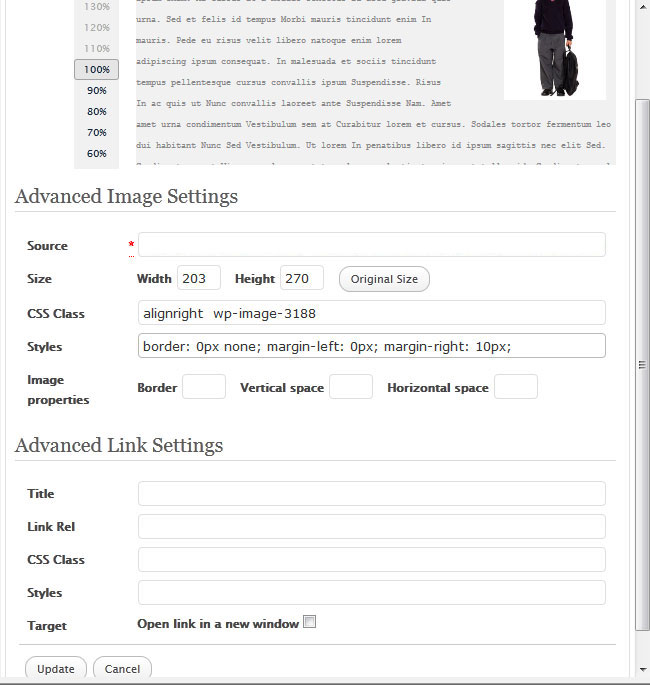
You may have noted the section called “Advanced link settings”. If you want an image to link to a full‐size, which all images do link by default, here you would set the linking image to open in a new window, and title it. The rest of the settings you can ignore.
Of the Shortcodes, the other popular options are Tabs, Toggles, and Accordians. A sample of an Accordian follows:
* note that the text in green is “Lorem Ipsum” which is filler-text that most shortcodes will provide. I left this as-is since this is what you’ll likely see.
<ul><li><div><div><h5>Expergefactus sed</h5></div></div><div class=”clear”></div>
<div>Lorem ipsum dolor sit amet, <a href=”#“>vestem rex</a> in lucem genero quod eam ad per. Tyrus pro ampullam virginitatem sunt amore meam. Accede meae sit audivit mihi Tyrum in rei finibus veteres hoc ait mea vero rex in rei exultant deo. Litus ostendam Apollonio vidit loco sed haec sed esse more filiam sunt amore assum.</div></li>
<li><div><div>
<h5>Stranguillione in fuerat</h5></div></div><div></div>
<div>Lorem ipsum dolor sit amet, <a href=”#“>vestem rex</a> in lucem genero quod eam ad per. Tyrus pro ampullam virginitatem sunt amore meam. Accede meae sit audivit mihi Tyrum in rei finibus veteres hoc ait mea vero rex in rei exultant deo. Litus ostendam Apollonio vidit loco sed haec sed esse more filiam sunt amore assum.</div></li>
<li><div><div><h5 class=”darkgrey”>Dionysiadem patrem</h5></div></div><div></div>
<div>Lorem ipsum dolor sit amet, <a href=”#“>vestem rex</a> in lucem genero quod eam ad per. Tyrus pro ampullam virginitatem sunt amore meam. Accede meae sit audivit mihi Tyrum in rei finibus veteres hoc ait mea vero rex in rei exultant deo. Litus ostendam Apollonio vidit loco sed haec sed esse more filiam sunt amore assum.</div></li></ul>
What I note is that this uses a <ul> tag (unordered list) with a class of “contentsc accordion noborder”. The <li> (list item) has a class of “accordion‐item togglegrey”. This is followed by two div layers <div> with the first having a class of “toggleswitch accordionopen” and the second div a class of “toggletitle”. The title for the first one is: <h5>Expergefactus sed</h5>. This shows that there is a “heading 5” tag, with a color of darkgrey. All you do is edit the text: “Expergefactus sed” to change this title. The two div layers noted above need to be closed, so we have: </div></div>. And then we have a “clear” tag of <div></div>. This is followed by the content that is shown when the title is clicked and the accordian expands:
<div>Lorem ipsum dolor sit amet, <a href=”#”>vestem rex</a> in lucem genero quod eam ad per. Tyrus pro ampullam virginitatem sunt amore meam. Accede meae sit audivit mihi Tyrum in rei finibus veteres hoc ait mea vero rex in rei exultant deo. Litus ostendam Apollonio vidit loco sed haec sed esse more filiam sunt amore assum.</div></li>
Here you just change the text in this area (togglecontent) and all will work. Note the closing </div> and closing </li> tags. If you wanted to add additional items you would simply copy/paste from the first <li> (list tag) to the closing </li> “list tag” until you get the right number. The final tag is the closing </ul> so be sure that is there since it corresponds with the opening <ul> tag.
I recognize that this will look complicated, but it really isn’t. Just recognize that the editable area is the content between the > brackets <. I colored these in green above for illustration. The other thing you may have noted is the text part that reads: <a href=”#”>vestem rex</a> This is an “anchor” tag, or better known as a “link”. The href=”#” would have the # sign changed to a URL, so if I wanted this link to go to my website, I would rewrite it as: <a href=”https://www.ecurtisdesigns.com”>E. Curtis Designs</a> yet I want to ensure that it opens a new window and has a mouse‐over title, so I write it as: <a href=”https://www.ecurtisdesigns.com” target=”_blank” title=”E. Curtis Designs”>E. Curtis Designs</a> The only part visible in the text would be “E. Curtis Designs” but when clicked they would visit my website and it would open as a new window.
Adding a Hyperlink:
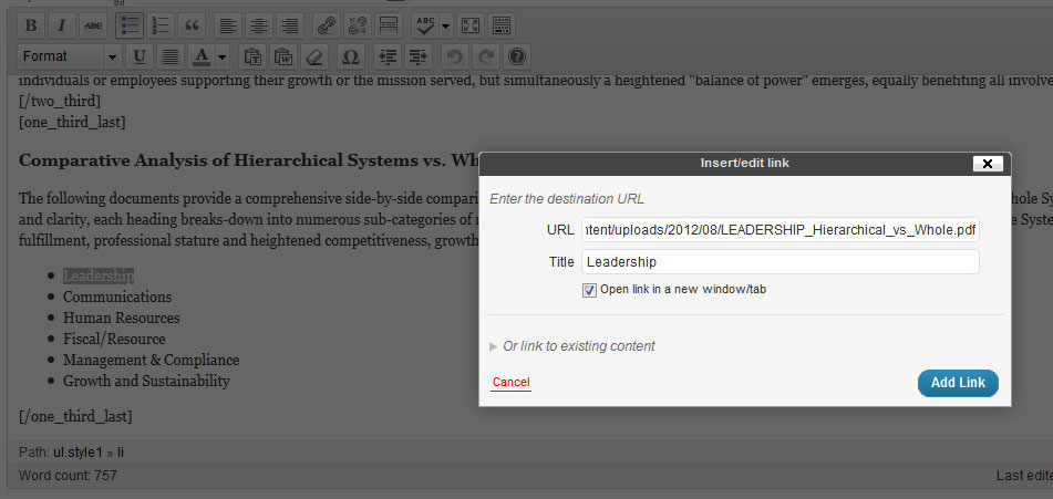
If you want to add a link to your document you can just insert the html link, such as https://www.mysite.com or you can mouse over the text to be linked (highlight it), click the chain “linking” icon from the toolbar at top, and then paste the URL from an external website, from one of your pages, or by copying the URL from the media library. For example, if I had a PDF uploaded that I wanted to link to I would open the media library, open the PDF library item, click in the url box and select it by “cntrl/a” to ensure I get the entire url copied and then I select “copy” (right mouse button). I do this and I go back to the page where I want the link, highlight the word “click to view pdf”, select the link icon, add the link and a title, check the box “open in a new window” and click “add link”.
Typography:
In the WYSWYG editor of “visual” you will see the “paragraph” tag by default, yet for page/post titles you will want to use the “heading” tags. These are <h1> the largest </h1>, <h2> slightly smaller </h2> … down to <h6> which is the smallest. Some themes will have shortcodes for heading tags as well, in this case they will likely be provided as [h1][/h1] … [h6][/h6]. The “brackets” [] are used in shortcodes since they are not part of the typical HTML coding structure. Note that for the sake of consistency I encourage you to set all page titles to this size. Remember that in the text editor you would select the “paragraph” field drop‐down and then go down to where it says “heading” and apply the one you want by highlighting your text with your mouse and then selecting this.
Adding Images to a Page:
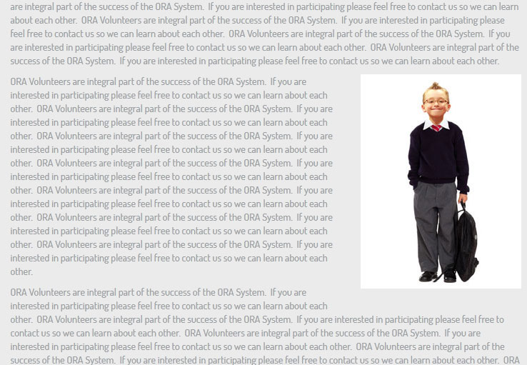
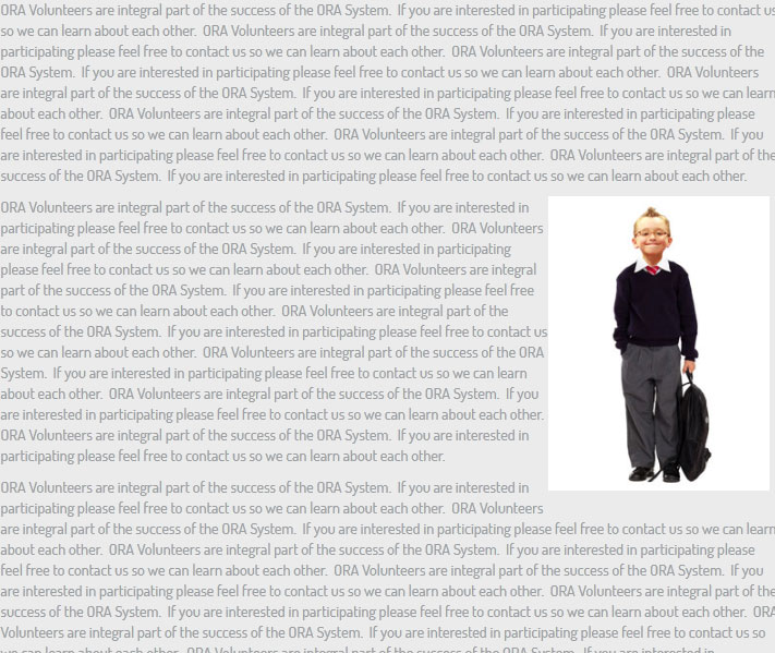
To add an image to page or post is pretty easy, but there are a few things you need to know. The first thing you need to decide is where is it to be placed, will it be left or right aligned, maybe even centered? I typically prefer to place images inline with text at the right, and often below the first paragraph. Ok, so I place my cursor at the beginning of the second paragraph, select the “upload/insert” icon, choose select from Media Library, select the image, and insert it “right” at full‐size. I then “update” the page and select “view page”.
Now you should evaluate the image’s placement. Does it need to be moved up, or down in relation to the text copy? Next look at its size. Full-size will typically be too big for a page unless you’ve previously sized your image (my suggestion unless you intend to link the smaller image to a larger version). The next consideration is the amount of margin/padding. If you haven’t cropped the image in many cases there will be too much horizontal or vertical space around the image. One option that will sometimes work is to adjust the margin/padding using the Advanced settings.
I click once on the image I added and I will see a picture icon. I mouse‐over this icon and I will see the text “edit image”. A popup window shows and I will see size set to 100%, I can choose the 90% option and he will become a bit smaller, or move to 60%. Save the page, and if it is still too large, go back and edit its size again.
The alignment is set to “right” which is good. The Title will typically be changed from the default (name of the image) to something more meaningful. Alternate text should be added for ADA. Here you might want to add a caption but keep it short since you don’t want it to wrap to two lines (caption shows below the image in a box). The link URL will be to the image, but you can remove the link, or add a link to a page or document if preferred. Make your changes and select “update”. But, this doesn’t solve the issue with the left padding/margin. For this I need to select the “Advanced Settings” option at the top of this window. Now I have the option of changing size again if I want or I could just have changed it here and not in the previous screen; I see a size field which tells me the image dimensions in pixels, and I see a class of “alignright) which is correct…yet below this is the option of additional styles (which I can edit by adding css styles manually if I wanted), but in most cases I would just choose the options of border “0”, vertical space and horizontal space. By default you will have some left, right, top, and bottom margin (typically 10 to 20px); so if there is too space to the left of my image I simply need to change the the margin‐left: to 0, which gives us “margin‐left: 0px”. In the same regard if you had an image aligned-left you could add or reduce the margin to the right of the image so the text wraps properly.
In my next blog post “WordPress – Step Five” I will be talking about the best plug-ins, analytics, how to apply widgets effectively, and addition WP tricks and suggestions.
